
1,200 Words / 5 min. Read
The National Risk Index (NRI) was released by FEMA in 2021 to assess which communities are most at risk from natural hazards.1,2 It combines disaster risk data with measures of social vulnerability and community resilience to create a Risk Score for each county in America.
If you don’t like the term “climate haven,” that’s understandable; we’ve written about that here. There’s no place on Earth that can escape the effects of climate change, but some locations are more vulnerable than others. So we’re using that term to refer to a town, city, or region that’s projected to experience less risk from climate-fueled crises, specifically extreme weather and natural disasters.
If you’re considering moving somewhere safer (or just wondering what risks you’re facing in your region), the NRI is a great resource; we’ve used its data extensively in our collection of climate risk maps, and we’ve referenced it in several posts here as well.
That said, there are a few caveats to consider when using this data to search for a more secure location, especially when it comes to future climate risk. In this post we’ll look at how to best use the NRI for that purpose.
Risk Score vs. Annualized Frequency
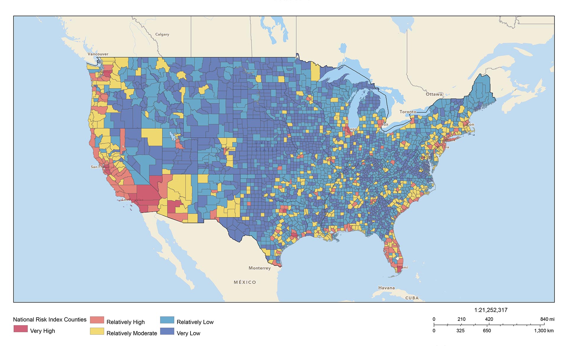
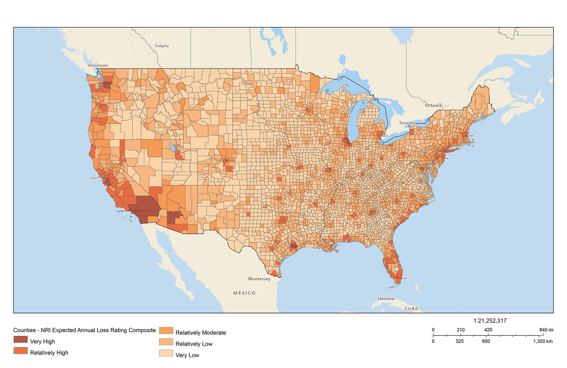
When you open up NRI data in the Resilience Analysis and Planning Tool (RAPT),3 you’ll be looking at a map of Risk Scores. This is mainly a measure of Expected Annual Loss, or the economic impact of disasters in a given area:
As stated in the technical documentation:
The National Risk Index’s most important and principal component, Expected Annual Loss, is a robust measurement that quantifies in dollars the anticipated economic damage resulting from natural hazards each year.2
That data is then converted into percentile rankings, with a corresponding Risk Score and Risk Rating:
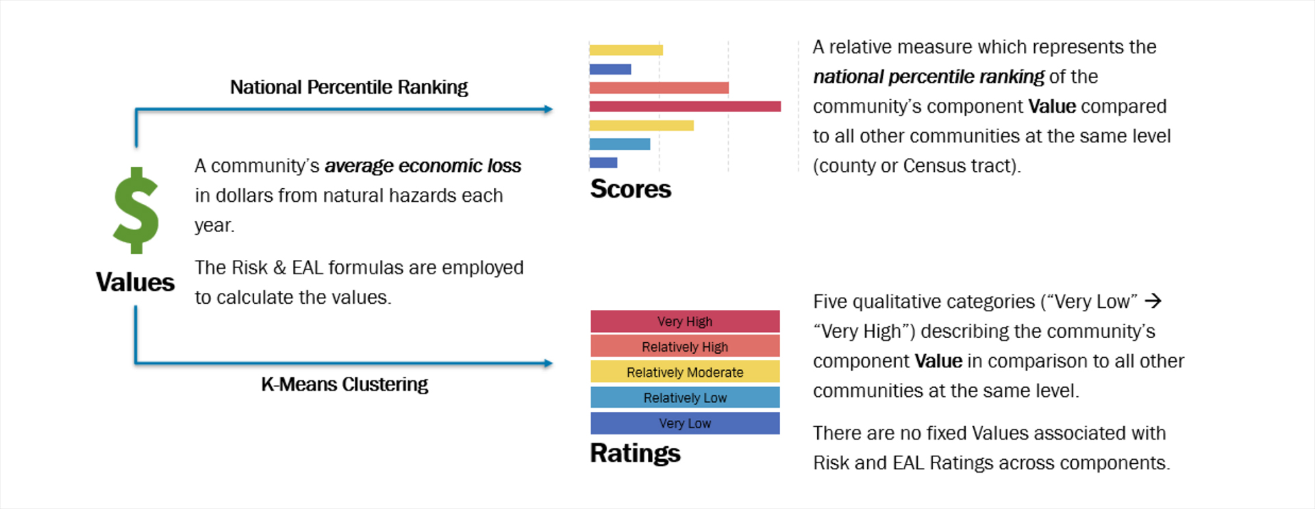
While the economic impact portrayed by Risk Scores is useful for governments and policymakers, it’s not the best metric for individuals, especially if your goal is to find a place that’s less exposed to natural disasters and extreme weather. For that, we need to turn to Annualized Frequency:
The natural hazard annualized frequency is defined as the expected frequency or probability of a hazard occurrence per year. Annualized frequency is derived either from the number of recorded hazard occurrences each year over a given period or the modeled probability of a hazard occurrence each year.2
In other words, Annualized Frequency measures the actual risk of a disaster occurring in a given area. If you’re looking for a safer place to call home, that’s the metric you’re looking for.
Unfortunately there’s no way to view Annualized Frequency within RAPT, as it only displays Risk Scores. The only way to see that layer would be to extract the values from the dataset and turn it into a map. So that’s exactly what we did! In our collection of risk maps, every map that uses data from the NRI has 2 versions; one for Risk Score, and one for Annualized Frequency.
For some factors, Risk Score and Annualized Frequency look very similar, as is the case for wildfires (Risk Score on the left, Annualized Frequency on the right):
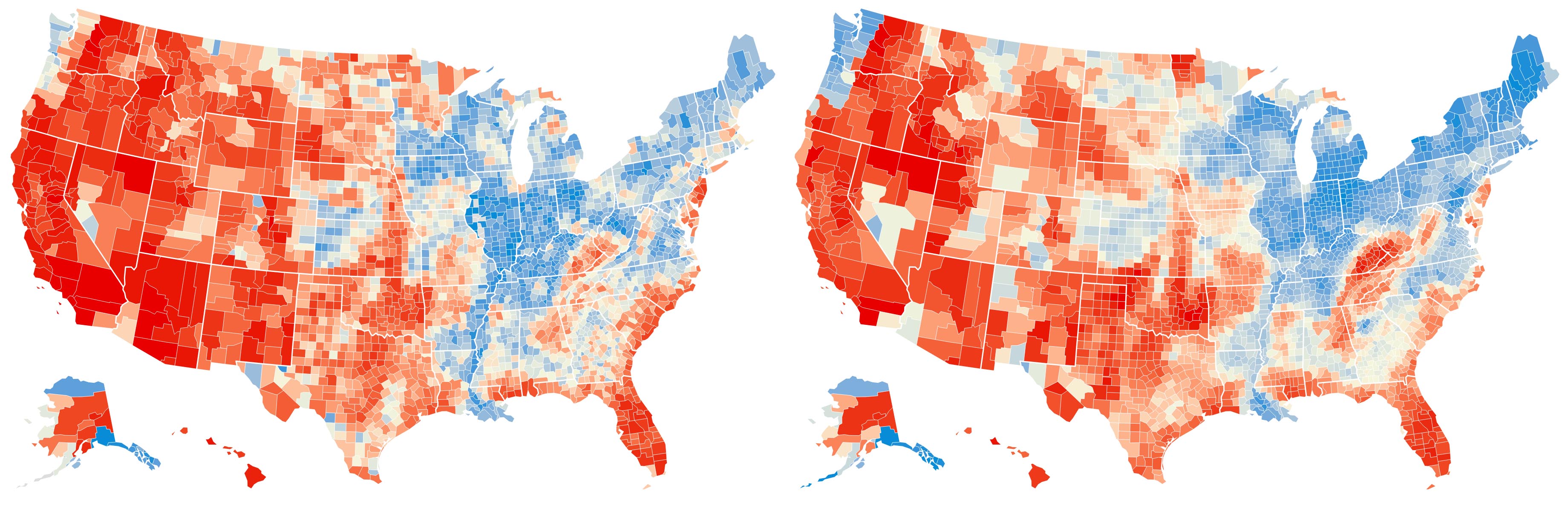
With other risk factors there’s a bigger discrepancy, such as for winter weather:
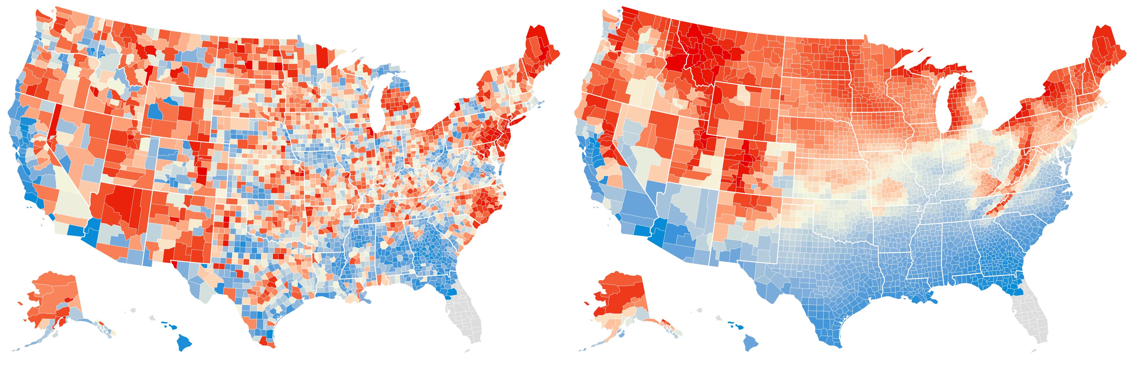
By including both, you can see which parts of the country are most exposed to risk, and how that risk translates into economic impact. This is the best approach we’ve found for using this data to evaluate vulnerability on a national scale.
Current vs. Future Risk
The second big consideration with the NRI is that it’s a measure of current risk, not future risk. If you’re looking to find safety now, it’s a great tool; if you’re looking out through the end of the century, that’s a different story. This is what Alex Steffen calls a “horizon of concern:”
One way in which our needs differ profoundly is our timelines.
If you’re retired and single, without kids, accepting the short-term odds on increasingly probable catastrophes might be a valid choice. Short planning horizons let us discount future risks.
Taking those same chances becomes reckless, though, when we consider the prospects for our kids or the young people we care about in general. Our horizon of concern dictates that we ready ourselves for a world beset by chaos and calamity, in part so we can help our kids be ready in turn.
Our popular debate still treats 2050 as far ahead, and 2100 as another world. Yet babies born today in wealthy countries are statistically likely to live to see the year 2100.4

If you’re in your 60s and just looking to ride out the next couple decades, the NRI is a good resource as risks aren’t likely to vary greatly over that timescale, especially over large regions. Generally speaking, hot places will get hotter,5 and wet places will get wetter;6 places that flood will flood more often,7,8 and places that burn will burn more often.9,10 But the trends you’ll see in NRI data will remain broadly the same, especially in relative terms.
If you were born (or have children born) after 2000, you’re looking at a much farther horizon for you and your loved ones. And as we move into the second half of the 21st century, our future becomes much more uncertain. We’re likely to see unprecedented events across the country; wildfires in Michigan,11 110-degree days in Alaska,12 over a foot of sea level rise along the East Coast,13 and possibly AMOC collapse.14 The longer your timescale, the less accurate NRI data will be.
How We’d Use this Data
If your goal is to build resilience for decades to come, we recommend you look at the NRI alongside projections of future risk, which account for a changing climate (preferably under high-emissions scenarios).15 We’ve included many future projections in our collection of risk maps, and will continue to update them as new data emerges.
At the same time, it’s important to be aware of the limits of prediction. The farther out (and the more specifically) we attempt to project things like disaster risk, the less likely we are to be accurate.16,17,18 Rather than using these risk maps to determine the chances of a disaster occurring in your specific city or county, we recommend looking at broad, regional patterns and preparing for inevitable disruptions.
A resilient location doesn’t just have low vulnerability to extreme weather and natural disasters; it should also have a sustainable population and access to key natural resources. Demographics, housing prices, public health ratings, cultural amenities, infrastructure resilience, and climate adaptation plans all factor into this choice as well.
If you’d rather save yourself that work (or just see what results we came up with), we considered all of these factors when creating our guide to regions and cities that are best-placed to survive in a warming world. We’ve also written a walkthrough for the Climate Vulnerability Index, which is another good tool for evaluating risk.
Whether you use our guides or run the numbers yourself, we hope this post helps you understand what you’re looking at with these maps, and how to use NRI data in your search for a more resilient location.
Footnotes & References
- National Risk Index for Natural Hazards (FEMA)
- National Risk Index Data Technical Documentation (FEMA)
- Resilience Analysis and Planning Tool (FEMA)
- The Horizon of Your Concern (Alex Steffen, The Snap Forward)
- Mapping U.S. climate trends (Jake Crouch, Climate.gov)
- Changing precipitation normals (Climate Central)
- Inequitable patterns of US flood risk in the Anthropocene (Oliver Wing, William Lehman, Paul Bates, Christopher Sampson, Niall Quinn, Andrew Smith, Jeffrey Neal, Jeremy Porter, Carolyn Kousky, Nature Climate Change)
- Climate Change and Inland Flooding (Climate Central)
- 1 in 6 Americans live in areas with significant wildfire risk (John Muyskens, Andrew Ba Tran, Naema Ahmed, Anna Phillips, The Washington Post)
- Performance of Fire Danger Indices and Their Utility in Predicting Future Wildfire Danger Over the Conterminous United States (Guo Yu, Yan Feng, Jiali Wang, Daniel Wright, Earth's Future)
- Climate change presents increased potential for very large fires in the contiguous United States (Renaud Barbero, John Abatzoglou, Narasimhan Larkin, Crystal Kolden, B.J. Stocks, International Journal of Wildland Fire)
- Alaska just hit a climate milestone (Lois Parshley, Grist)
- Sea Level Rise (U.S. Climate Resilience Toolkit)
- Warning of a forthcoming collapse of the Atlantic meridional overturning circulation (Peter Ditlevsen, Susanne Ditlevsen, Nature Communications)
- Explainer: The high-emissions ‘RCP8.5’ global warming scenario (Zeke Hausfather, Carbon Brief)
- The Physics of Climate Prediction (R. Saravanan, Cambridge University Press)
- Predictability Beyond the Deterministic Limit (Brian Hoskins, World Meteorological Organization)
- Climate Models Can’t Explain What’s Happening to Earth (Zoë Schlanger, The Atlantic)